
Results at a Glance
ABOUT THE CLIENT
Argyll are a premium flexible workspace provider, offering luxurious offices to rent in prime central London locations. As well as offices to rent, they also provide coworking, meeting room and event space hire.
Site: Argyll
The Issue
As a leader in London’s flexible workspace industry, Argyll were investing a significant amount on paid advertising to drive traffic to their site. However, their conversion rate (the number of enquiries they received from that traffic) was relatively low.
After we ran a conversion audit of their marketing funnel, we could see their enquiry form was poorly optimised.
We see this a lot. Despite playing a critical role in the marketing funnel (the form is the point where a user decides to be a customer) forms are often overlooked.
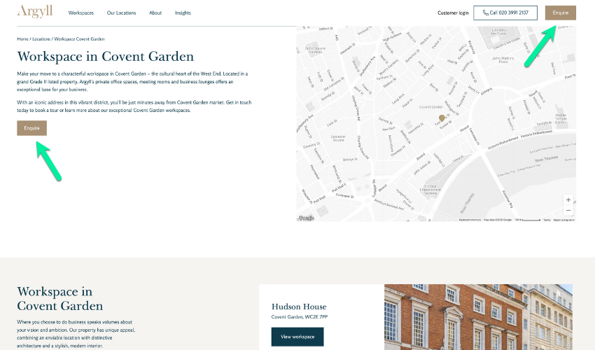
To submit an enquiry the user had to click on an Enquire button which took them to a separate Contact Us page. This wasn’t ideal. A new page takes time to load, especially on mobile, and can be disorientating for users. Therefore its always good practice to keep them on the same page if you can.
When users arrived at the Contact Us page, they were confronted by a traditional, one-step form (a series of questions with drop downs). By today’s standards, one-step forms are less than desirable and convert poorly on mobile devices where users have to scroll.
The Solution
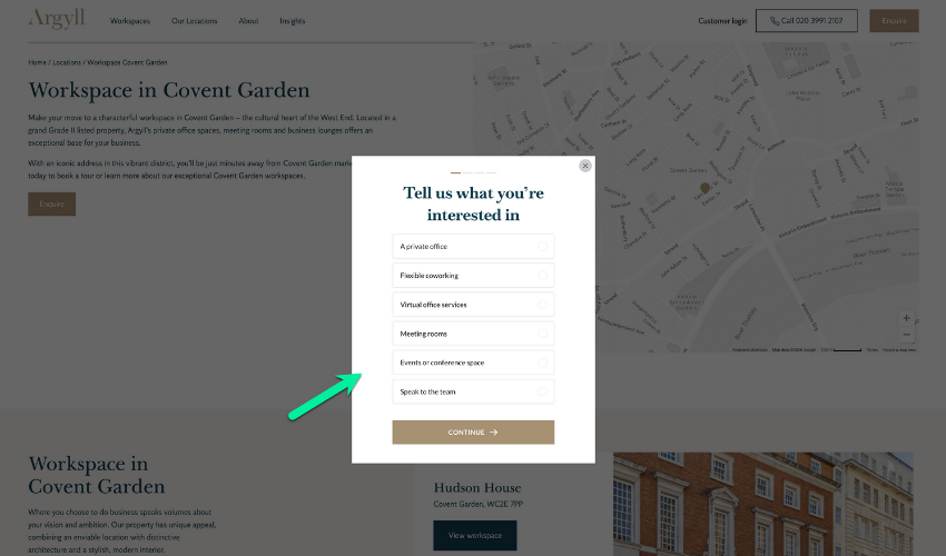
Enter the multi-step form.
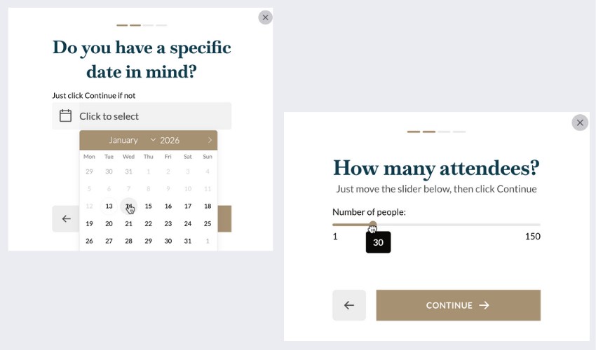
We took the questions that were asked in their old form and put them into a multi-step form. We didn’t add any new questions – we just repurposed what was already there, adding one question per step.
Here’s the thing that some find surprising but is backed up by the data: users always react better to forms that are broken up into one question at time. Is it peoples reduced concentration span? Our preference for bitesized chunks? Ease of use? Its probably some or all of the above. We just know they work, and there are countless examples of multi-step forms outcompeting one-step forms across different industries.
To tackle the open-in-new-page issue mentioned above, we configured the form so that when a user clicked on the Enquire button, a pop up appeared with a greyed out background from within the same page, rather than users getting redirected to a new page.
As for roll out strategy, we implemented the new form on a subset of pages to start with. After carrying out the usual tests, checking the form rendered well on different browsers and devices (especially mobile), we hit publish.
The Results
As a result of the new form, enquiries tripled!
There were zero other changes to the Google Ads setup or website. The tripling of conversions was a direct consequence of switching the form out.
We then proceeded to roll it out across all pages on the site, running A/B tests to further improve the conversion rate.
Summary
You can see the power of reimagining the enquiry form.
You should think of your form as a mini-funnel. Once users have started to click, then it’s your job to keep them there and get them over the finish line. Choice of questions is important, but so is the sequence of questions. The great thing is you can add interactivity into your questions too, making them easier to fill in.
Optimising for Conversions (for increased gains)
One of the most important reasons for using multi-step forms is that you can see what your users are doing.
Traditional one-step forms are a total black box. You don’t know whether the questions you are asking resonate with your users. You don’t know where your users are getting stuck.
With multi-step forms you get data about what users are thinking at every step. You can see the percentage of people that bail out at each step (the drop off rate) and tweak your questions accordingly. You can also A/B test individual steps to fine tune your funnel and max out the number of users you get through your funnel.
This all equals more leads, more revenue, and a more profitable business from the same amount of traffic or ad spend. It even creates happier customers, as you’ve made their life easier to get through the pain of filling out a form.
Happy days 🙂
A Word from the Client

Michaela Wrede
Head of Marketing, Argyll
“I had the pleasure of working with Ged on a CRO project, and the results were incredible – he helped us triple our conversions! Ged combines sharp analytical skills with excellent technical knowledge and a real talent for innovation, always bringing fresh ideas and practical solutions. On top of that, he’s a joy to work with: collaborative, approachable, and genuinely committed to delivering results.”
Want Us To Do the Same for Your Business?
Book a free strategy session and lets discuss!